
Show off the brand, the right way.
Everything you need to show off the Hellyeah brand the right way: logos, colors, typography, and the rules that hold them together, all in one place.
The full lockup.
Our primary lockup combines the burst glyph with the Hellyeah wordmark. Use the orange version on light surfaces and the white version on dark surfaces. It must remain clearly legible against its background.











The compact mark.
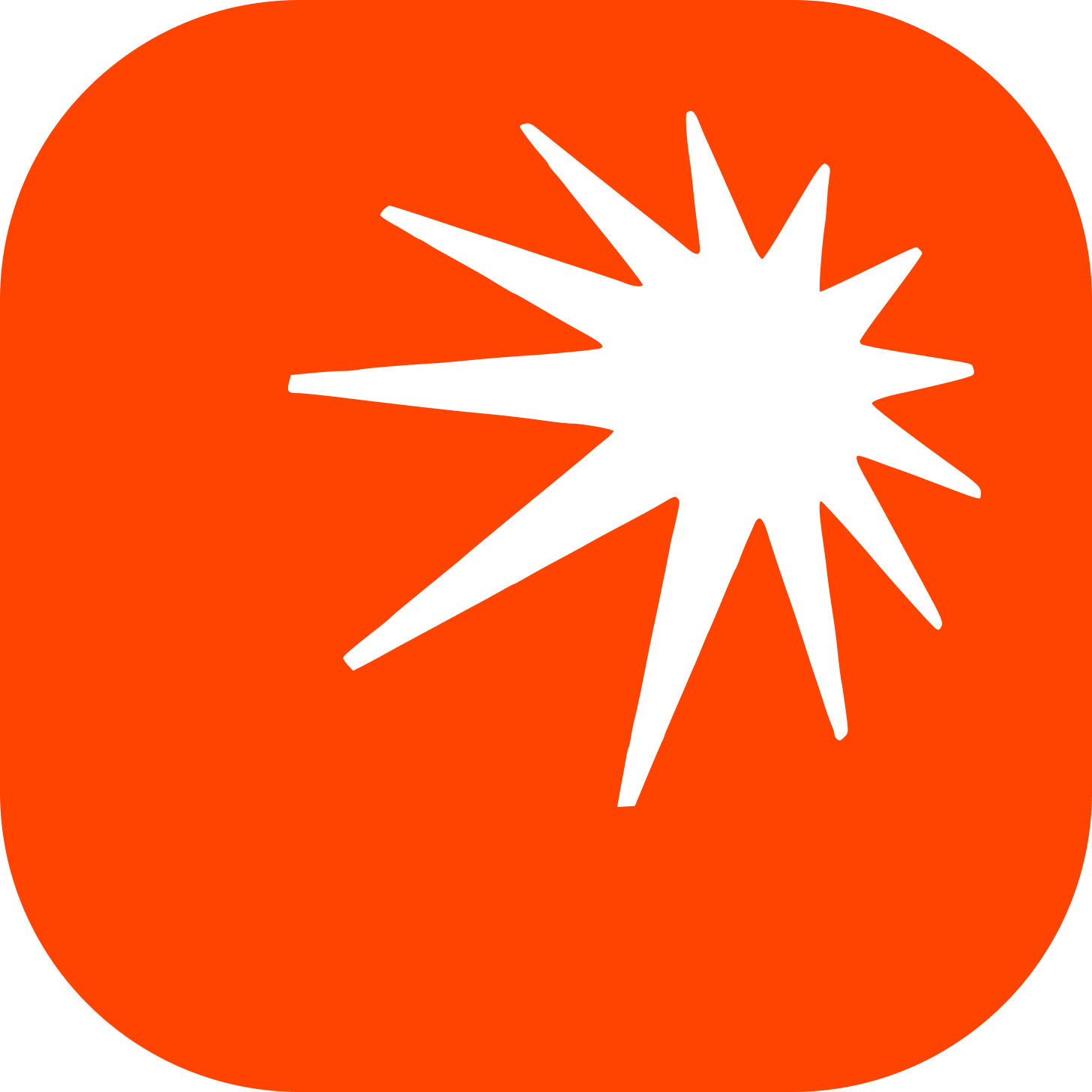
Anywhere a compact brand mark is needed, such as social platforms, app launchers, or marketplaces, use the stylized app icon. The orange field is reserved exclusively for the icon and should never be substituted.

Monochrome, with one spark.
Our primary palette is monochrome, black, white, and a single neutral gray, with orange reserved as the brand spark. Click any swatch to copy its hex value.
A grotesk and an italic.
Geist carries every UI surface, headline, and body block. EB Garamond italic is the editorial accent, reserved for the one noun phrase that makes a Hellyeah sentence sound like Hellyeah. Both are on Google Fonts.
The modern grotesk built for software interfaces.
The editorial accent, used italic and used rarely.
As a global brand, we support a wide range of languages. For Asian scripts we use Noto Sans for sans-serif and Noto Serif for serif, both open-source via Google Fonts and inheriting the same weight system as our Latin set.
Keep it intact.
To maintain brand integrity, the following are strictly prohibited. Use only the approved colorways, and never rotate, recolor, stretch, outline, or otherwise alter the lockup or glyph.
